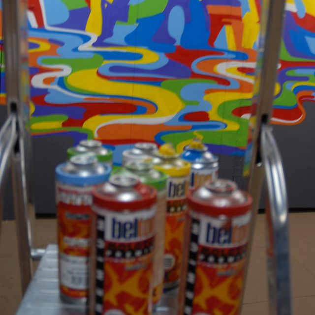
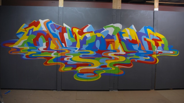
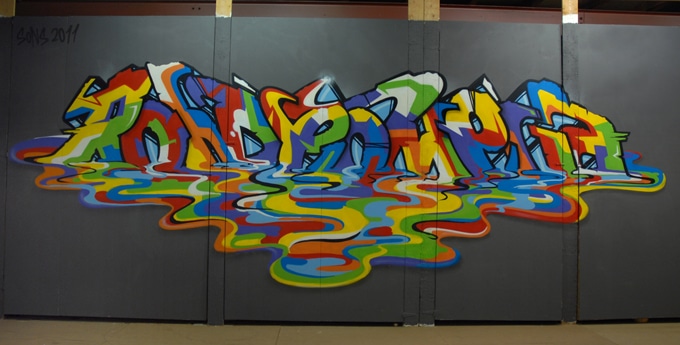
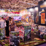
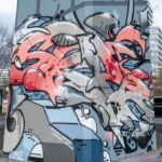
This time we did another experiment with primary colors. We wanted to add a melting effect to the letters without the lettersbecoming unreadable. To get the best result we thought that the fill in should be mostly done with hard edges and the melted part only with curly waves. It worked very well.
Peep the outcome after the jump!
More from the SONS here