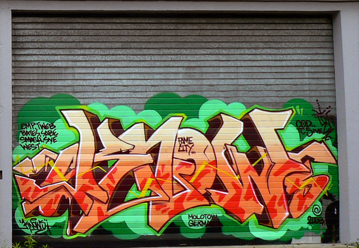
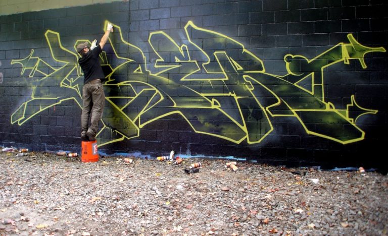
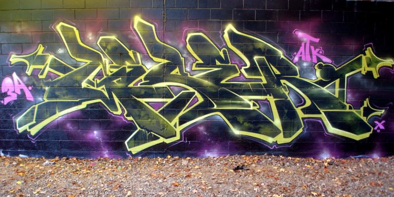
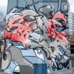
I wanted to limit my color palette on this one to keep a minimal look. To go along with the minimal color scheme, I freestyled letters that had very few extensions to have a simplified look, yet still read as a piece. The fill consisted of Black, Shok Evil olive, and Pear. For the outline, I used one of my favorite colors (Hemp) along with Poison green to shine it up a bit. A few purples and pinks around it, and that’s a wrap! (Geser)


ALWAYS UP TO DATE WITH THE MOLOTOW™ NEWSLETTER
Quality, innovations, graffiti and credibility – this means: stay hungry, stay foolish. Sign up for our newsletter in order to be up to date regarding news, exclusive discounts, events, fairs and artist features.